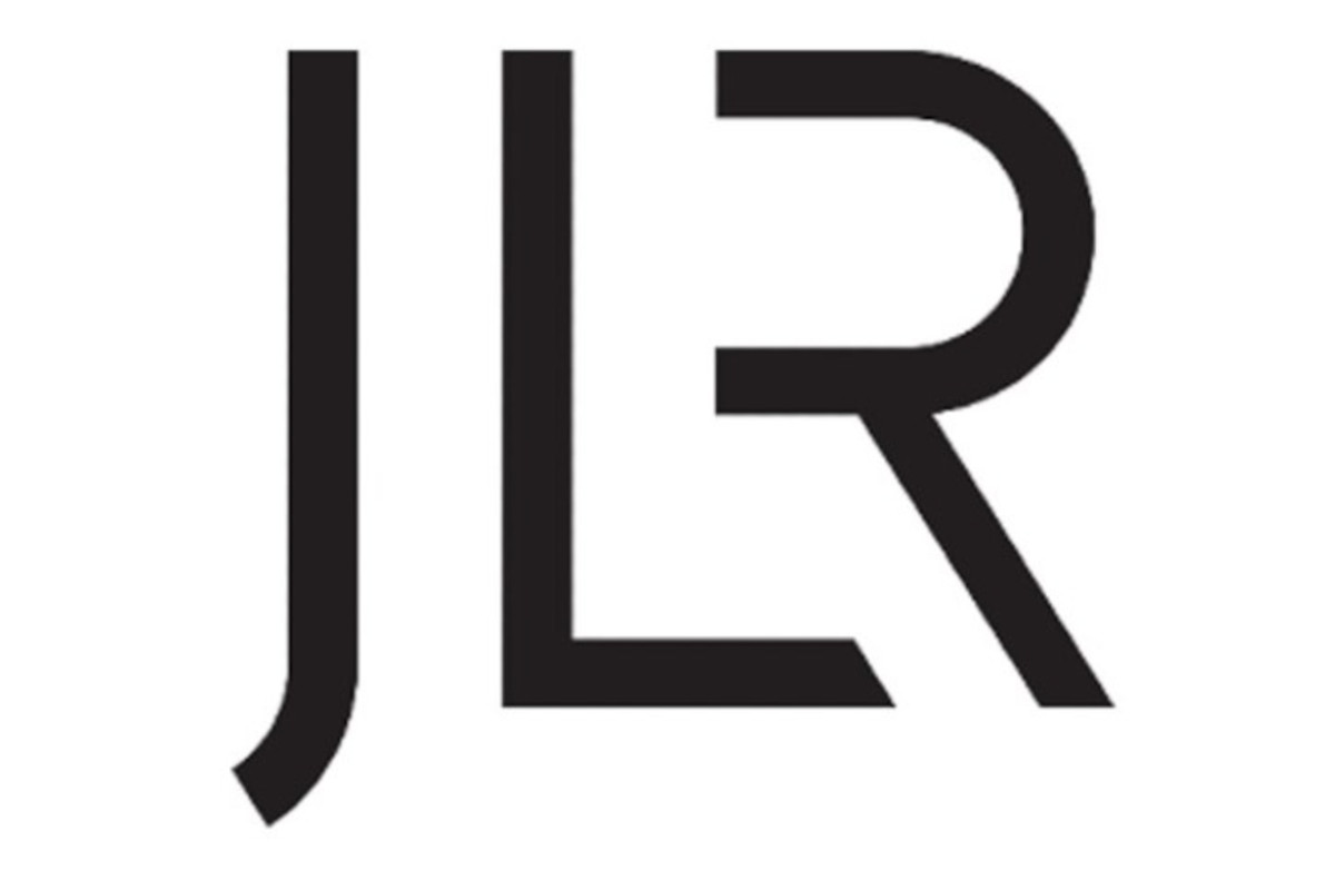
Jaguar Land Rover (JLR) is undergoing a rebranding effort to unify its four brands. The new logo for JLR, representing its new official name, embodies elegance, modernity, and forward-thinking. It aims to create a unified identity for the company rather than using separate Jaguar and Land Rover logos.
Despite the rebranding, the Land Rover brand will remain integral to JLR’s identity. The Land Rover logo, the trademark oval badge, will continue to be used for the Defender, Range Rover, and Discovery models. It will be a trust mark on official documentation to instil customer confidence and emphasize the brand’s quality.
CEO Adrian Mardell
On the other hand, Jaguar is transforming into an electric-only luxury brand. CEO Adrian Mardell has a personal connection to this shift, as he originally joined Jaguar 32 years ago. The company aims to recapture the essence of Jaguar from three decades ago and position itself as a leading luxury electric vehicle brand.
JLR’s CEO also mentioned that the company had resolved its chip supply issues, strengthening its relationships with chip suppliers. This allows JLR to start delivering models from its significant order backlog, with the majority comprising the Range Rover, Range Rover Sport, and Land Rover Defender models.
JLR Logo
Landor Associates, a global brand consultancy, designed the new JLR logo. The design process began with a deep dive into the company’s history, values, and products. Landor wanted to create a logo reflecting the company’s heritage and commitment to innovation.
The new logo represents the company’s new direction as a “House of Brands,” with each brand having its unique identity. The JLR logo will be used on all of the company’s vehicles, but each brand will have its unique logotype.
The new JLR logo has been met with mixed reactions. Some people have praised the design for its simplicity and modernity, while others have criticized it for being too bland and generic. Only time will tell whether the new logo will be a success.
Here are some of the critical design elements of the new JLR logo:
- Simple and minimalist design: The new logo is a departure from the previous one, which was more complex and ornate. The new logo is simple and minimalist, focusing on the letters JLR.
- Vertical alignment: The letters JLR are stacked vertically, with the J and LR in the foreground. The vertical alignment is meant to create a sense of strength and stability.
- Clean and uncluttered design: The overall design of the new JLR logo is clean and uncluttered. There are no unnecessary elements; the focus is on the letters JLR.
- Modern font: The letters are set in a sans-serif font that is both modern and timeless.
- Condensed font: The font is slightly condensed, which gives the logo a sense of strength and stability.
- Even spacing: The letters are spaced evenly, which creates a sense of balance and harmony.
- Single colour: The logo is rendered in a single colour, which gives it a clean and uncluttered look.
- Strength, luxury, and sophistication: Blue is associated with strength, luxury, and sophistication.
Conclusion
JLR’s rebranding efforts, focus on electrification, and improved chip supply are part of its strategy to revitalize the Jaguar brand and maintain the Land Rover brand’s equity and growth, particularly with the popular Range Rover and Defender models.
Source: JLR

