A Fresh New Look for Mazda
So, you’ve noticed something different about Mazda lately? No, it’s not another sleek new model (though that’s always exciting). It’s their logo! Yes, Mazda is jumping on the bandwagon of logo minimalism.
And let me tell you, it’s not just about looks – it’s about making a impact.
Out with the Old, In with the New
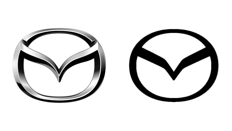
Remember the old Mazda logo? The one with the three-dimensional flair and that intricate “M” that looked like it was ready to fly off the badge? Well, say goodbye to that flashy design.
The new Mazda logo is all about simplicity. The three-dimensional elements? Gone. The “M” design? Streamlined and simplified. It’s like Mazda went to a logo boot camp and came out lean and mean.
The Big Reveal: Arata Prototype
Mazda’s new logo made its grand entrance on the Arata prototype during the Beijing show last April. If you missed it, don’t worry – the buzz was more about the sleek, futuristic design of the Arata.
But eagle-eyed enthusiasts noticed the logo switch and the internet went wild. When will we see this new logo on production models? That’s still under wraps, but we’re all eagerly waiting.
Why the Change?
So why is Mazda ditching the old logo? It’s part of a broader trend among car manufacturers. Simplified logos are easier to reproduce, look better on digital platforms, and give brands a modern, fresh look.
Plus, it’s all about staying relevant and appealing to the new generation of car buyers who value minimalism and clean design.
The Minimalist Movement
Mazda isn’t the first to jump on the minimalist logo train. BMW, Volkswagen, and Nissan have all given their logos a sleek makeover. The goal? To reflect a new era of digital and environmental consciousness.
For Mazda, the new logo symbolizes their commitment to innovation and forward-thinking design.
Impact on Brand Identity
Changing a logo is a big deal. It’s like getting a tattoo – it’s a part of your identity. For Mazda, this new logo marks a new chapter. It’s about shedding the old skin and stepping into the future.
The simplified “M” represents a brand that’s confident, modern, and ready to embrace change.
The Reaction
What’s the buzz on the street about Mazda’s new logo? It’s mixed, as you’d expect. Some folks love the clean, modern look. Others are nostalgic for the old, intricate design.
But that’s the beauty of change – it sparks conversation and keeps the brand in the spotlight.
What’s Next for Mazda?
So, when will we see the new logo on production models? That’s the million-dollar question.
Mazda is keeping things under wraps for now. But one thing’s for sure – when it happens, it will be a significant moment for the brand.
A Nod to the Future
Mazda’s new logo is more than just a design change. It’s a nod to the future.
It’s about embracing modernity, staying relevant, and appealing to a new generation of car buyers. It’s a bold move that shows Mazda isn’t afraid to evolve.
Conclusion
In the world of automotive design, change is the only constant. Mazda’s new logo is a perfect example of how brands must evolve to stay relevant.
It’s a bold, modern, and simplified design that reflects the brand’s commitment to innovation and forward-thinking.
So, keep your eyes peeled for that sleek new “M” on the roads. It’s a sign that Mazda is driving into the future with confidence and style.


